Client: Qrown
Role: Visual designer
Year: 2019
Role: Visual designer
Year: 2019
Development Buro Noort
Project type: Branding, Visual design
Services: Design
Deliverables: Styleguide
Services: Design
Deliverables: Styleguide
Quote from Client
____________________________
____________________________
"Liesbeth is professional, listens and knows how to translate our needs into a design that works. The result exceeded our expectations."
Rob Kroon - General manager Qrown Quality Management
The Project
____________________________
____________________________
Qrown extended their services with 2 new branches. They were looking for a way to build on their brand success even though this was based on a different field of business. The idea of colour coding by branche was quickly decided upon through research and in collaboration with the client. Building on a familiar brand gives confidence their quality will reflect on their other branches and give the user a good indication of the new services Qrown has to offer.
Stakeholder interviews and bench marking competitors helped determine the information architecture. Using these tools help create a renewed website that will be future proof for further ambitions by Qrown.
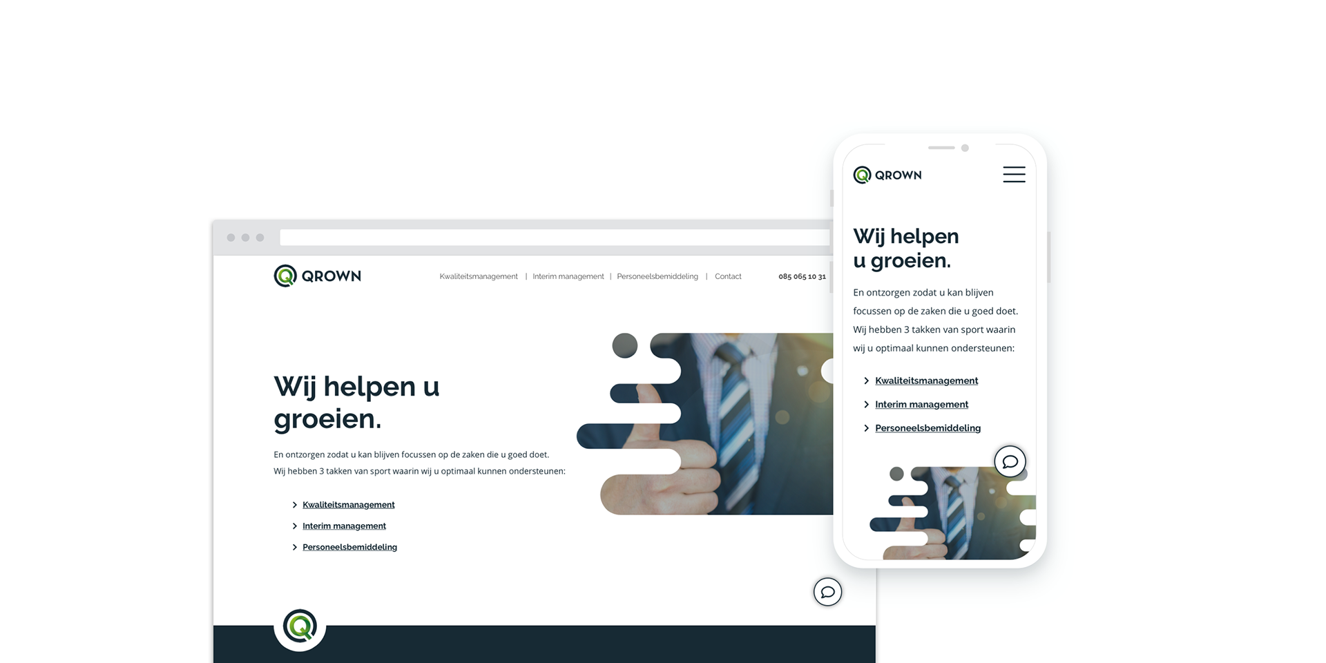
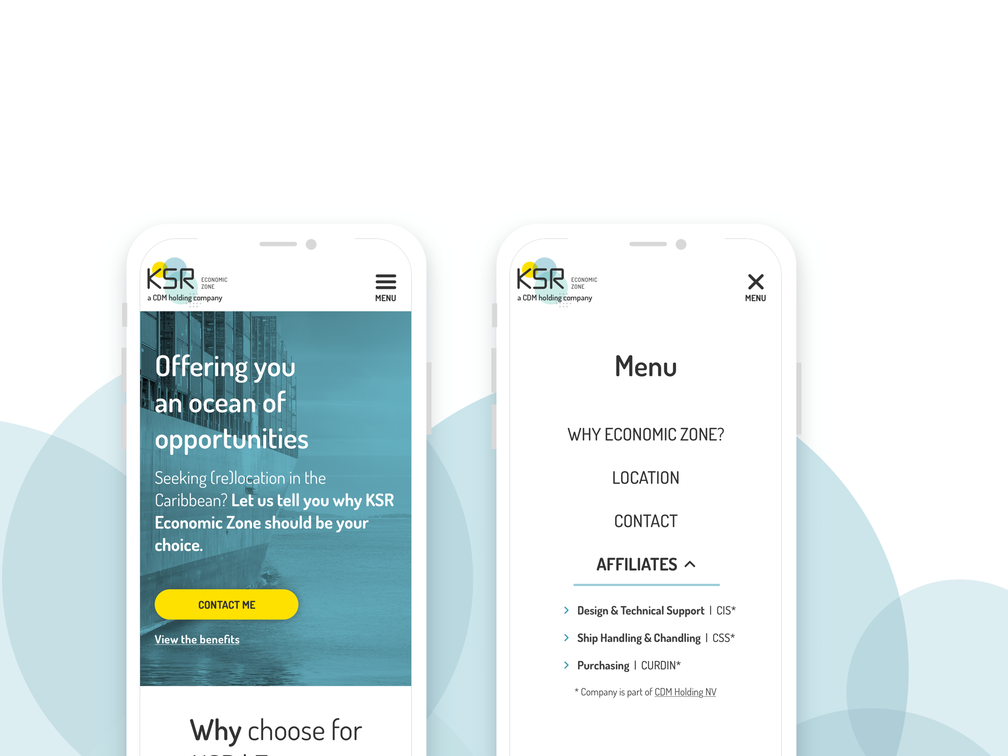
Homepage offering the renewed services of Qrown
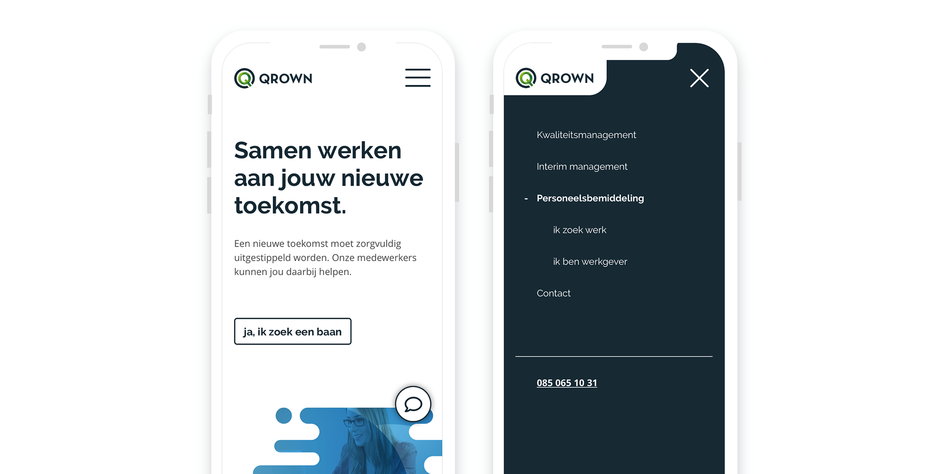
Mobile screens: Recruitment services (blue) | Mobile Menu
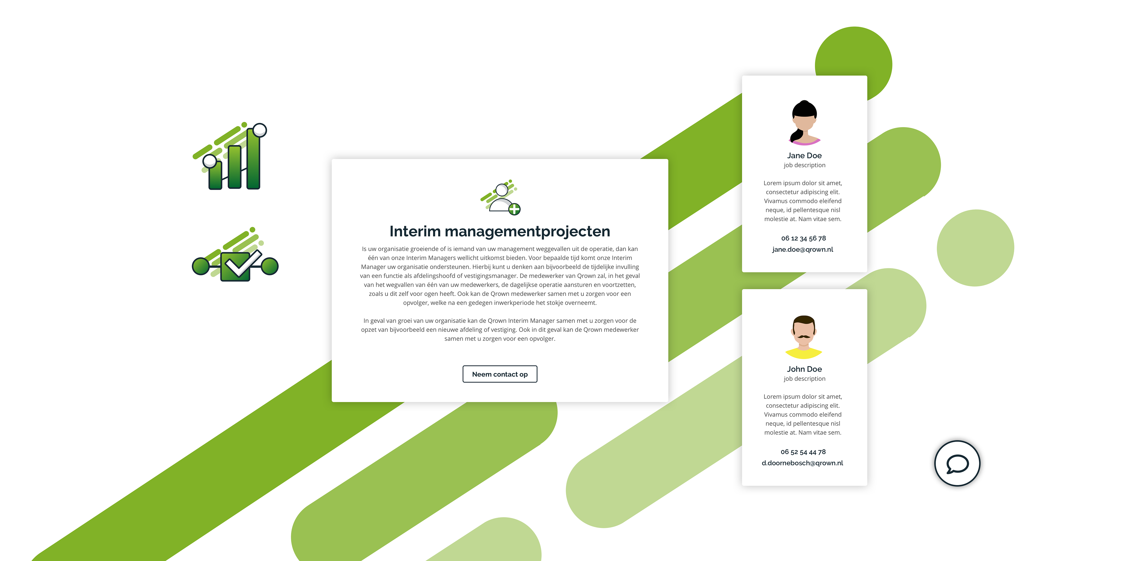
Visual elements: Illustrations | Quality (Interim) management services (green) | Contact cards | Back to top button